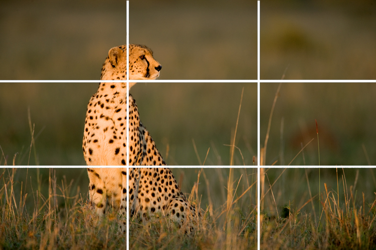
Anyone who has spent any time in the creative industry has head of a term called the “rule of thirds.” As much as it’s used, though, it’s no cliché. In fact, it’s a very real principle that people use to achieve results the rest of us happily take for granted.
However, the rule of thirds can also be split up into 9. This is especially important when it comes to photography. When you do this, it becomes clear which parts of the image are most important and how to focus on them for the best effect.
The rule is so ingrained into our conscious, that if you take about any raw photo and divide it up into 9 equal images, you’ll immediately see how it needs to be cropped to be the most visually pleasing it can. If an image isn’t visually pleasing, it’s simply not doing its job.
When you combine the two rules, however, you have a strategy for web design. Creating a web page, for example, is different than presenting one static photo. You have multiple areas you want to draw the eye to, so cutting it up to focus on just one area won’t work.
That’s where the rule of thirds comes in. Create 9 separate parts for your webpage and then look where the lines intersect. They’re the thirds for each plane. Here is where you should center either important images or start the symmetry for a word or phrase.
While it may seem overly complicated, it’s easy once you start practicing. Despite this relative ease, however, it’s the cornerstone of all good web design.

